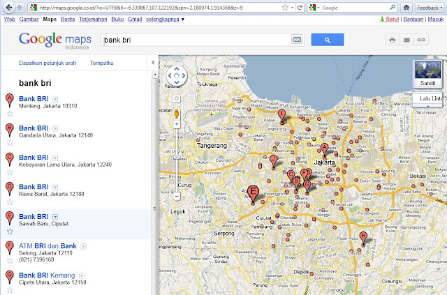
New Look at Google and Google Maps Tuesday, Google's redesign looks. Not just on Google Search, Google Maps also has a fresher appearance. Major theme at this new design is "more focused, elastic, and effortless."


Display Google Maps now has seen many angles, see the printicon, email and a link on the image above contained in the light graybox, which at last look, but all three also contained writings iconbeside it (see picture below).
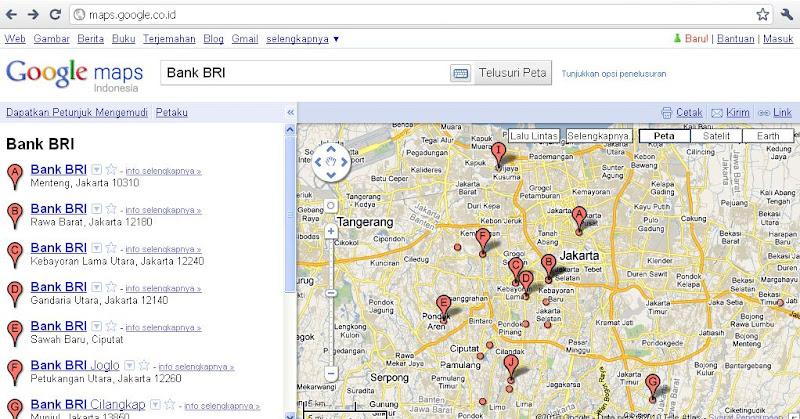
old-google-maps

But apparently, Google is forgetting something, namely the loss ofthe feature "View in Earth Link", where users can directly downloadthe My Maps KML files with one click. For the moment, Google onlyprovides a small solution for users who want to download the My Maps as a KML file by adding '& output = kml "(without quotation marks) at the end of the URL in the browser address bar and pressenter.

You can read more about this new look at blogsgoogle-latlong.blogspot.com. In addition to redesigning the look ofits Google also released a new social network named Google +Project, which in large sieve-sieve sebaga pesain Facebook (?). Ifyou look at the demo site Google + Project, you can zoom and panas easily as on Google Maps, because it is a demo site wascreated using the Google Maps API.